The evolution of frames and their relationship to architecture, PART 1
Posted: 31 Mar 2020 by PML
Picture frames, from gilded mediaeval polyptychs to the contemporary mouldings we use today, have an intimate connection with elements of architecture – in their structure, the profiles of mouldings, and the kind of ornaments with which they’re decorated. This is partly because frames most often function like doors or windows: they are openings onto other worlds or different visions, and an architectural border to the opening helps the mind of the spectator to focus on those separate spaces, and to isolate them from surrounding reality.
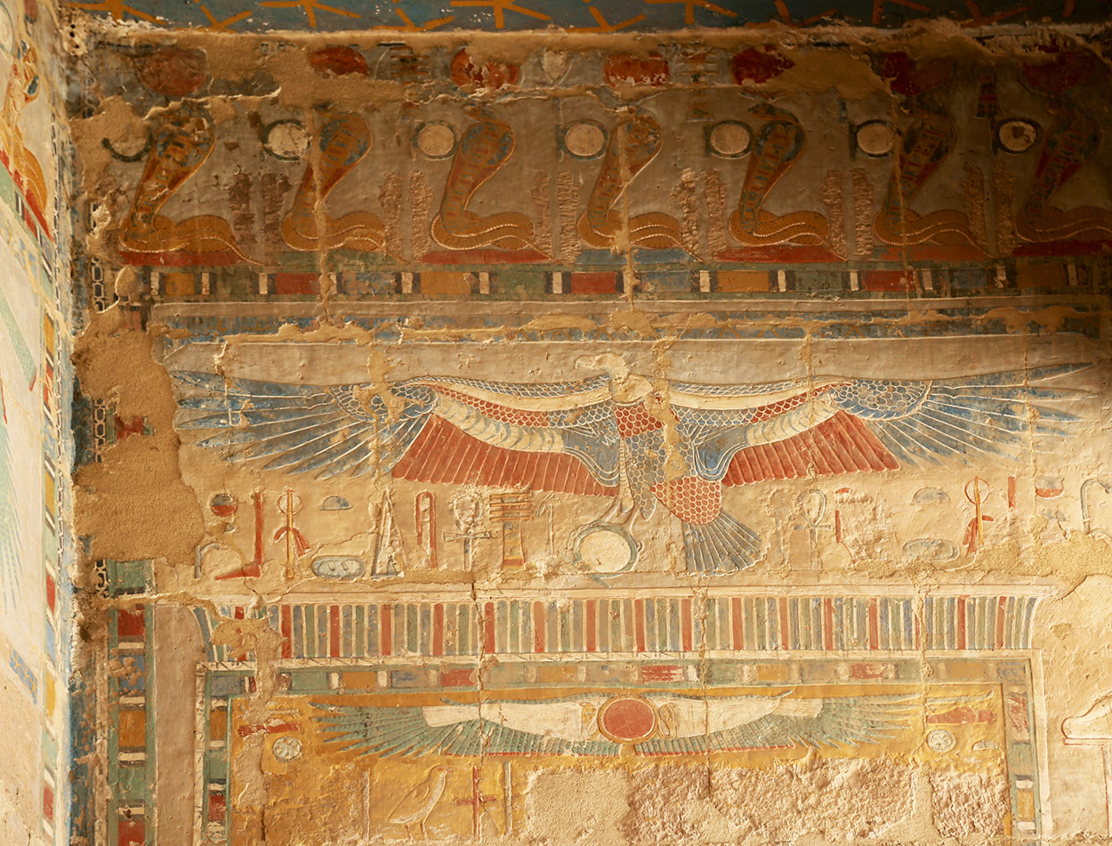
Some of the earliest frames were part of an architectural interior: for example, the flat decorative borders of geometrical ornament which divided pictorial fields in the temples and tombs of ancient Egypt. These, although three-&-a-half thousand years old and more, were also timeless, continuing to be used in various forms around Renaissance frescos and modern murals.
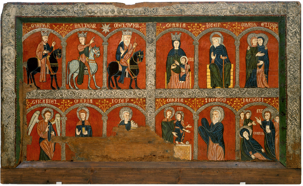
The ancestors of the three-dimensional frame could be decorated with flat or low-relief polychrome ornament, which might also, as here, use stylized architectural niches, aisles or arcades to separate different scenes. These were part of the decoration applied to altars, whether stone or wooden box altars, where raised joinery borders became bands of ornament and were painted with the same sort of motifs used for wall paintings and sculptural borders. Altars of this sort seem to have been used from perhaps the 9th or 10th century until the 13th, when versions of the pictures which decorated them were created to stand on the top of the altar, at the back – the dossal. These were the earliest form of altarpiece, and shared the rectangular silhouette and flat ornamental border of the altar frontal.
Gradually, however, artists, framemakers, architects and patrons began to realize the potential of a sacred painting raised on the top of an altar, where it became much more visible to the whole congregation. The orientation of picture and frame began to change to a vertical axis, and the form of the whole structure to echo the shape of the church in which it stood. There was great symbolic significance in this change, since the altarpiece became an expression of the Celestial Church, encompassing visions of the Madonna and Child, angels and saints, within the earthly church.
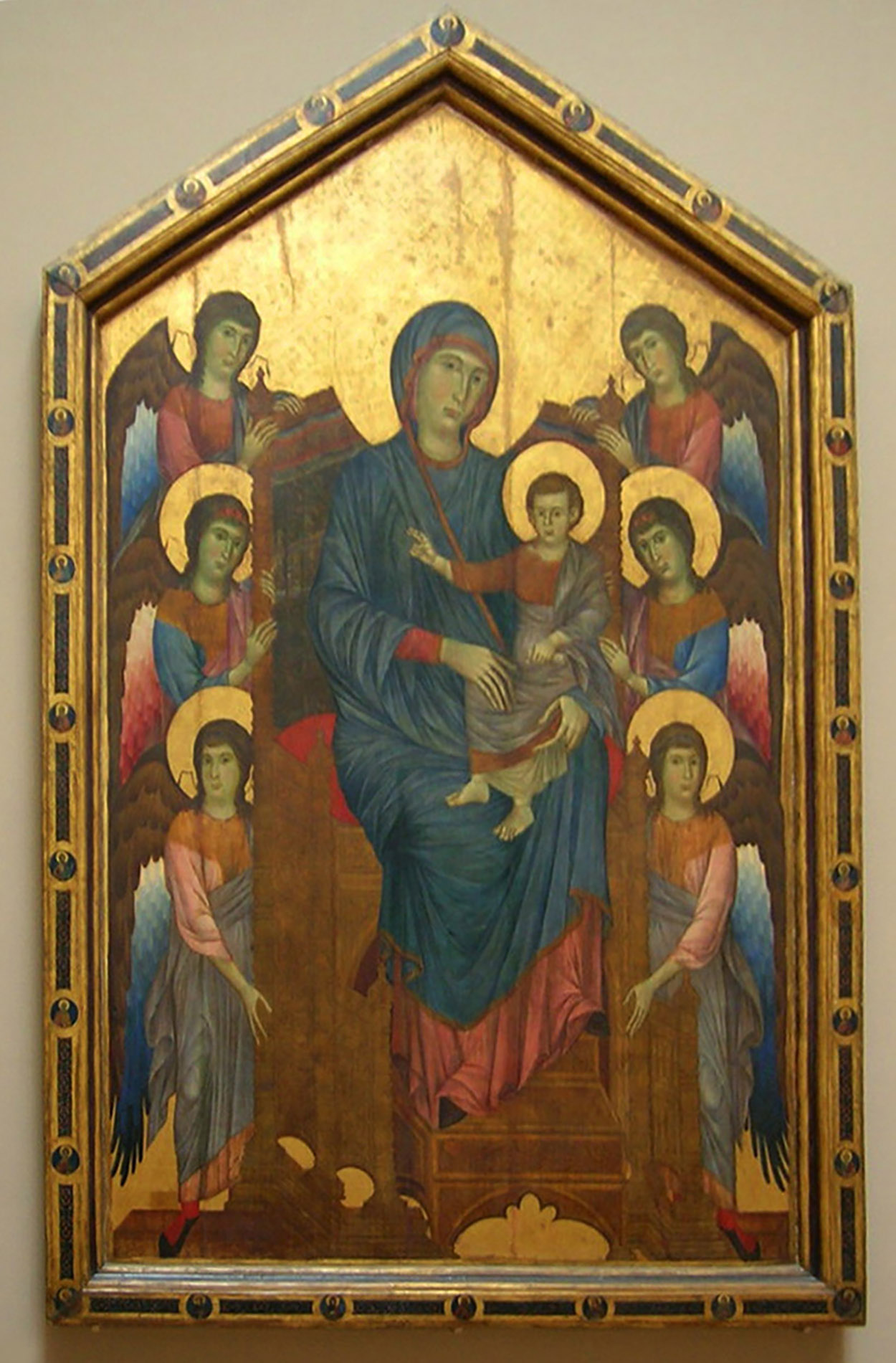
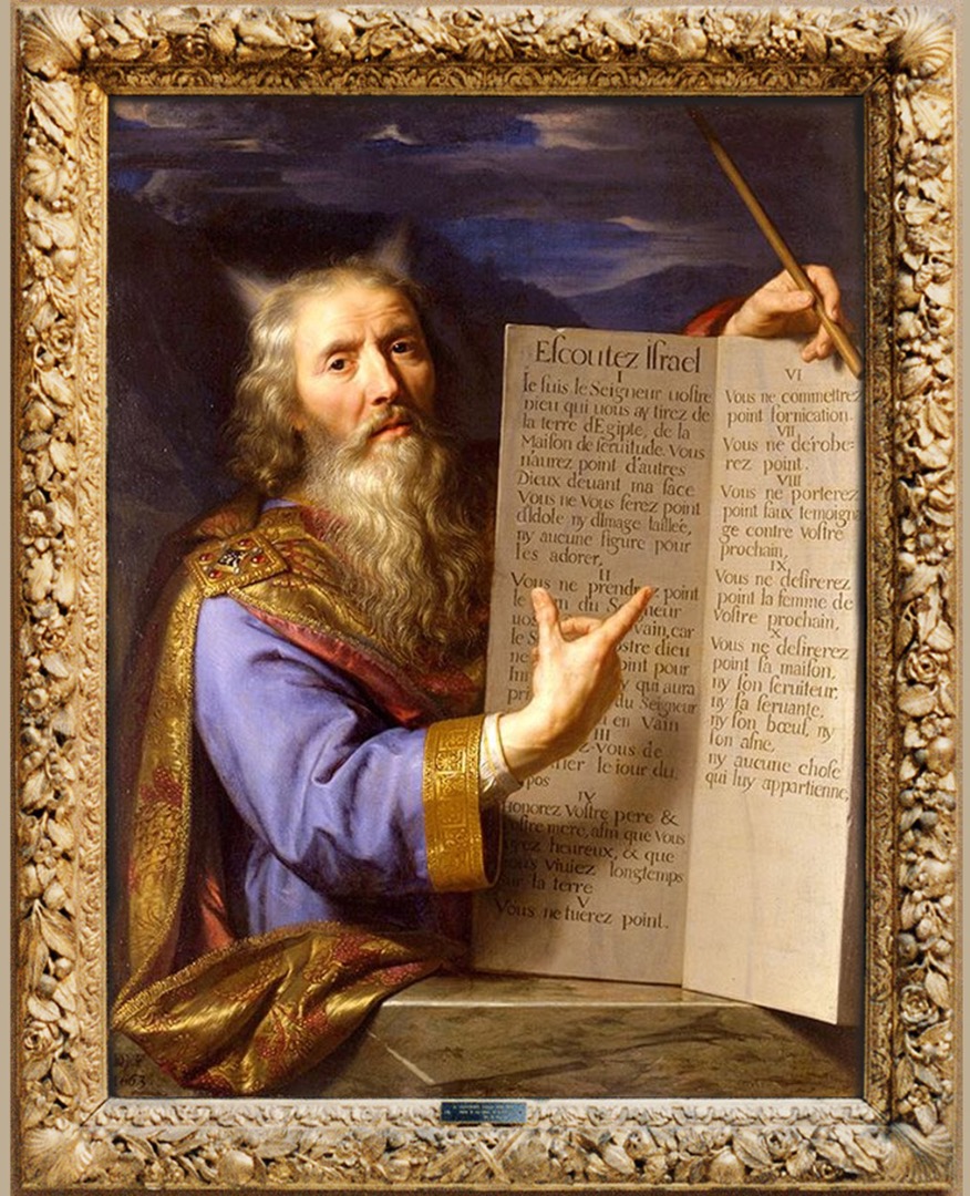
At first it was just a simple peaked outline, with a flat-topped frame which provided an extra field for images which expanded on the main picture, as well as for decorative motifs. In the case of Cimabue’s Maestà, the frame was painted with twenty-six roundels holding the heads of prophets, saints and angels, with the head of Christ Blessing at the top. This type of frame was based on the early basilica church, with a barrel vault beneath a canted roof – this was sometimes expressed in a frame (most frequently in small, portable diptychs and triptychs) as a round arch beneath a triangular top.
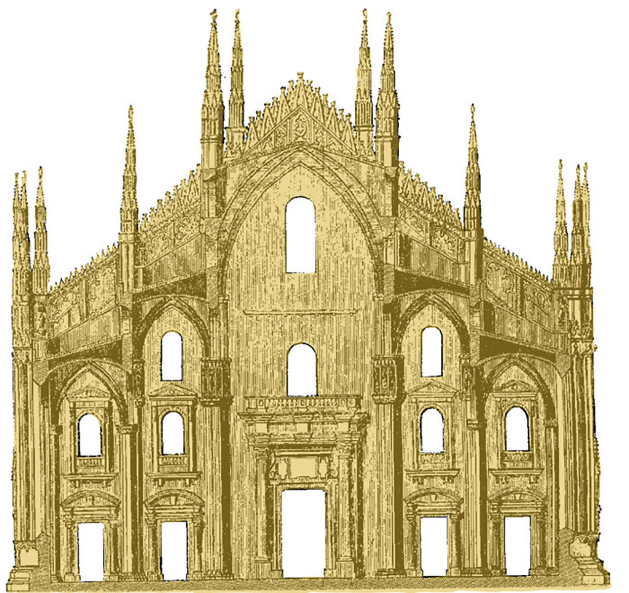
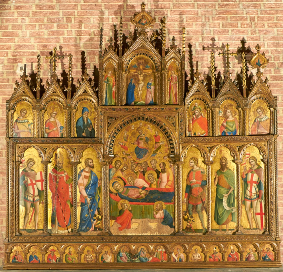
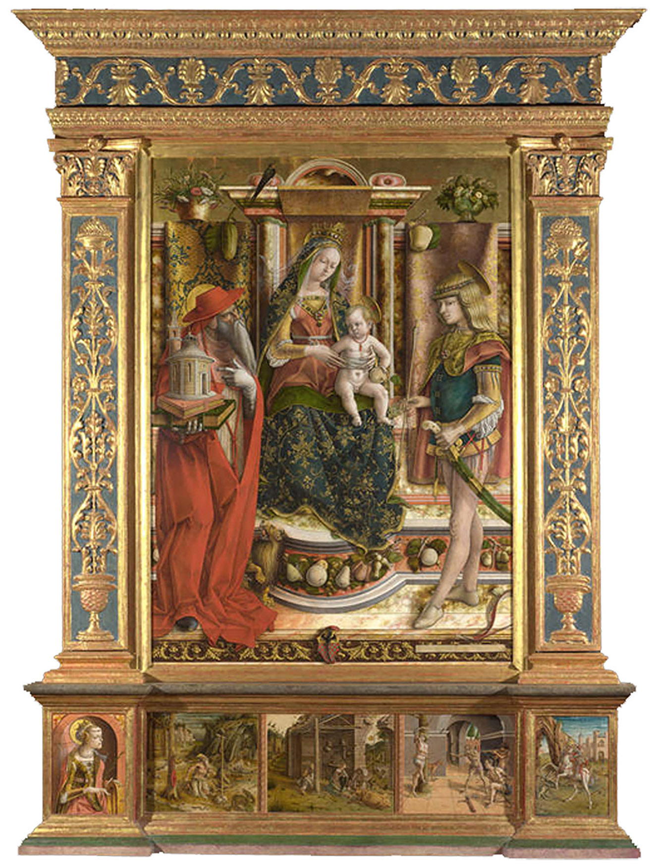
Once the idea of the altarpiece as the cross-section of a church had taken hold, however, the structure evolved quite rapidly to become the façade of a full Gothic church, with tiers of painted panels echoing the different levels of the building (the main church, crypt and clerestory), and panels at either side of the principal picture (the nave), which functioned like side aisles and chapels, and held figures of saints, prophets or angels. The various niches were defined by small plain or barley-twist colonets with capitals which supported decorative arches, ‘roofs’ and finials, and could even develop into arcades of repeated niches. The tiers allowed hierarchies of image to evolve, with Christ or God the Father at the top, as in the highest finial of this Veneziano altarpiece, which has the Crucifixion in the upper tier, with half-length saints at the level of the clerestory, the scene of the disciples surrounding the Virgin’s deathbed in the ‘nave’, and further saints to left and right in the ‘chapels’. The predella panel at the bottom represents the crypt, with a scene of the Madonna and Child in the position which the Lady Chapel often takes, and further figures of saints and bishops.
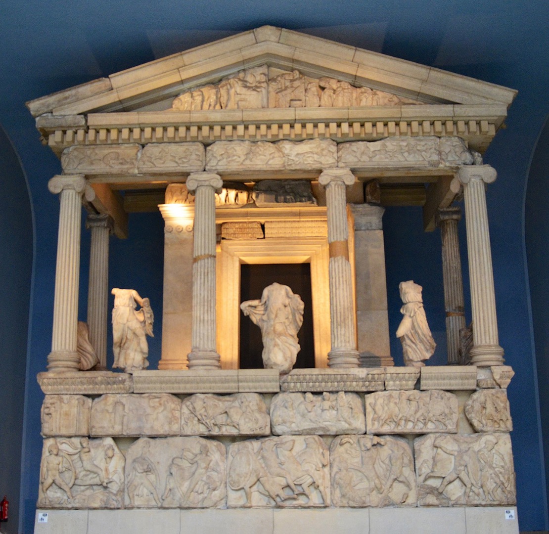
However, in the 15th century the style of ecclesiastical architecture was radically altered by a newly-revived interest in Greek and Roman culture, artefacts and buildings. The architect Brunelleschi (1377-1446), incited by Donatello’s descriptions to go to Rome and see the classical remains, spent three months examining Roman ruins, studying their use of proportion, form and ornament, and then returned to Florence, using what he had learnt to transform the churches he built there. Instead of the spires, peaks and finials of Gothic architecture, Renaissance buildings used the rectangular structure of a classical temple, raised on a plinth, with a linear entablature supported on classical columns, and sometimes a triangular pediment.
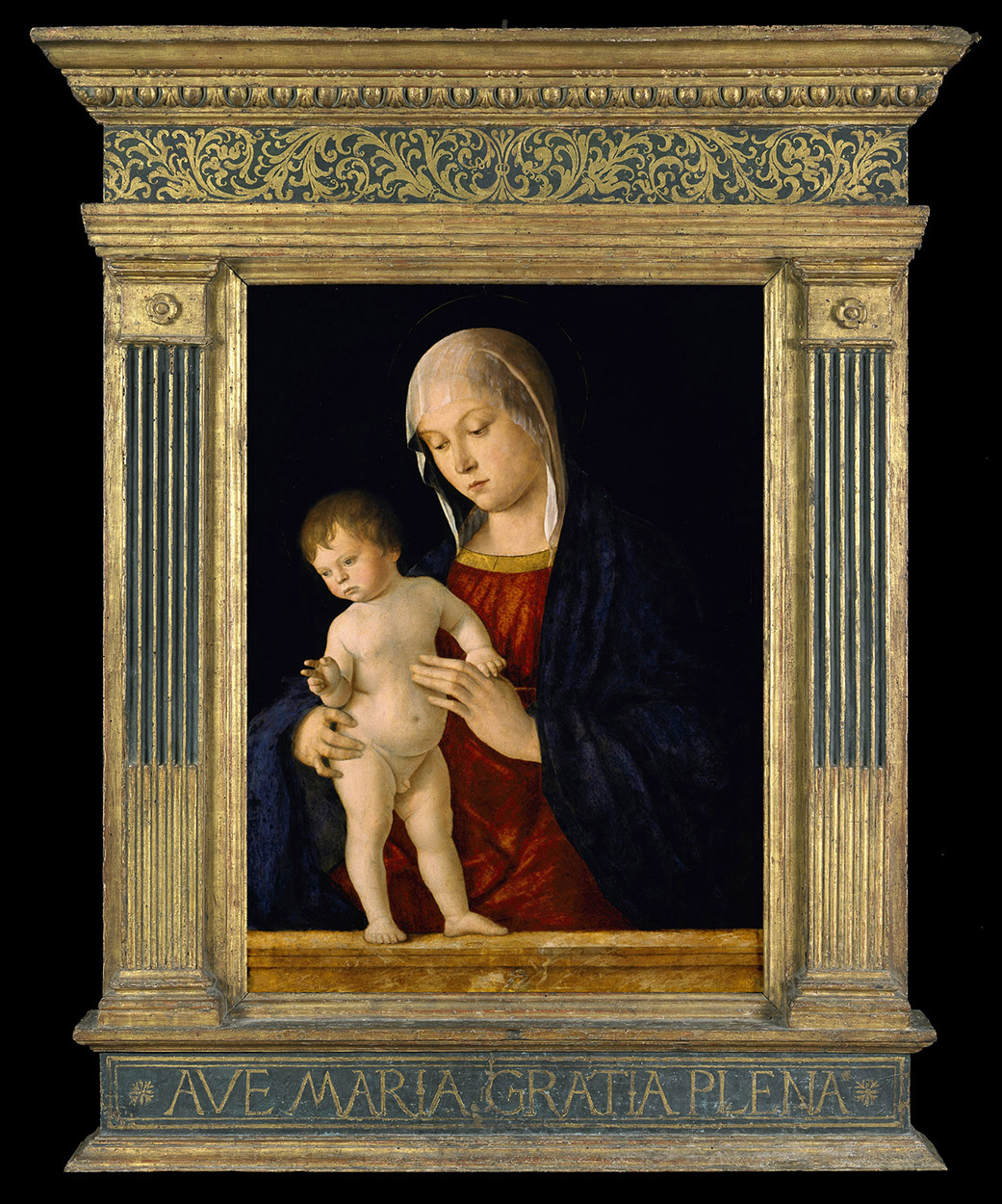
The many panels of the Gothic polyptych changed at the same time into one pictorial surface – the ‘quadro’ or rectangular support – where a single scene took place in a realistic perspectival space, with all the figures interacting. Now, instead of the spectator looking at the silhouette of a celestial church, containing multiple different compartments with gold grounds, it was as if he or she were really looking through a door or window, shaped like the opening in a classical building, onto a scene which could be taking place on the other side of the wall which supported it.
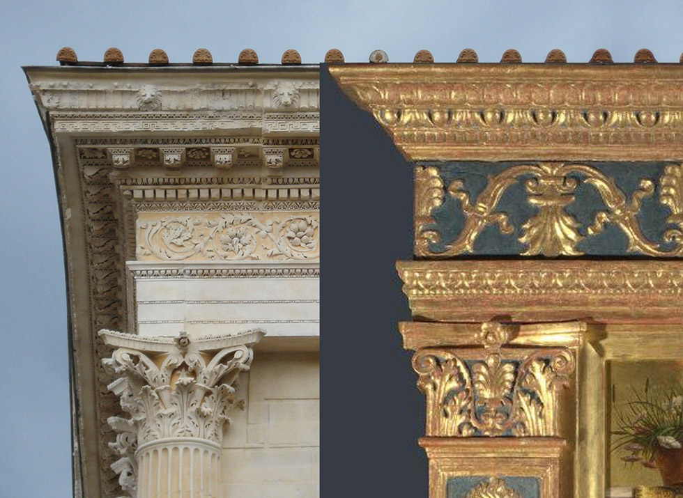
The more linear, plainer shapes of the entablature, pilasters and plinth were given richness and ornamental grandeur through carved, applied, painted, and gilded decoration, and the motifs used were most frequently also architectural in origin.
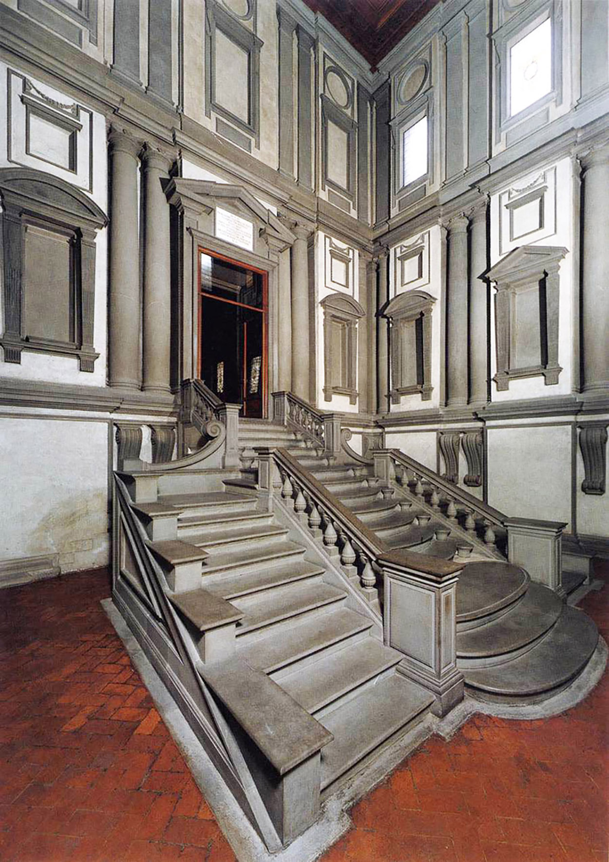
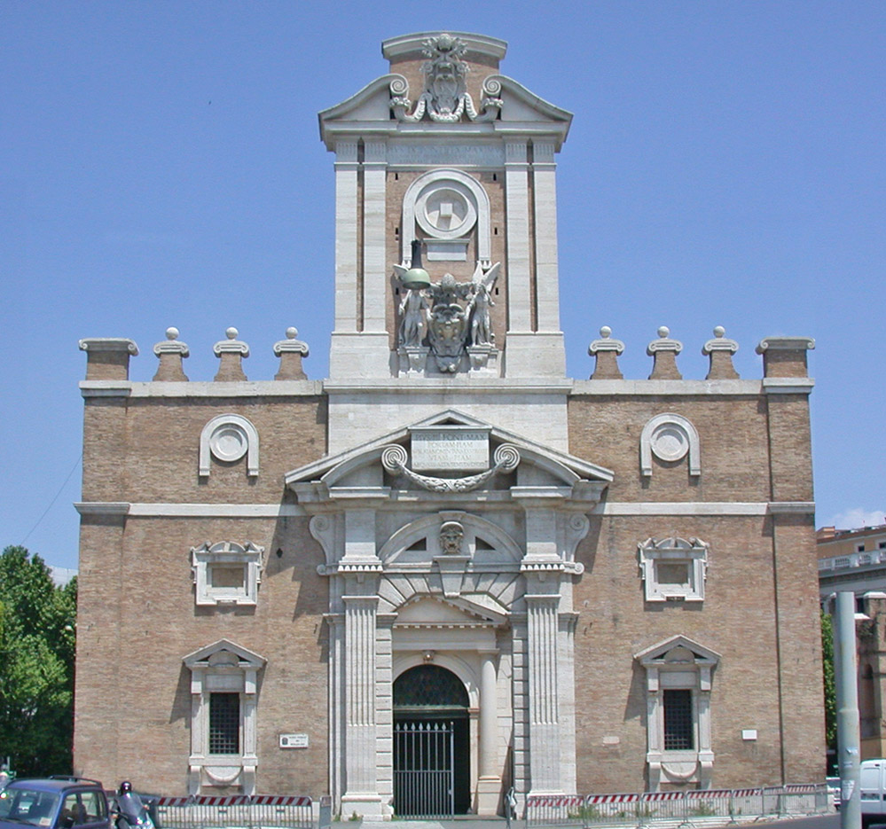
By the early 16th century, the restraints of this classicizing style – always depending on measure, proportion, and conformity to the parameters of classical architecture – had become another kind of gateway, through which Michelangelo – inventive and witty – broke, to create a variation on the genre of Renaissance frames. Once again, the model was architectural. In the 1520s he designed the Biblioteca Laurenziana – the Laurentian Library in Florence – in which he played with and subverted the forms of classical Renaissance architecture. Doors and windows were elongated; pilasters were tapered instead of straight; pediments were enlarged and pushed upwards; and elements such as massive scrolls and volutes were introduced. By the end of his life, when he designed the Port Pia in Rome, he had assembled a whole vocabulary of what is now called Mannerism, nearly all of which is on display – the piling up of several forms of distorted pediment in the exaggerated doorcase (a triangular shape containing an open swan’s neck pediment, with a segmental pediment beneath it); a swan’s neck pediment at the top, with an arc floating above it; hugely elongated lower windows supported on out-curving modillions; scrolling brackets; the middle tier of windows with their outset corners.
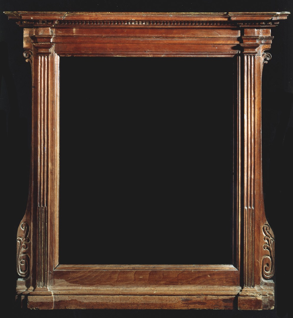
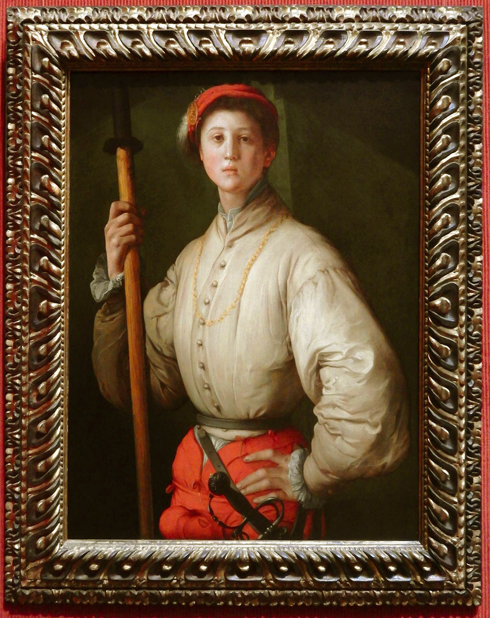
Many of these elements were transferred to picture frames, where they harmonized with the style of Mannerist paintings (elongated, serpentine figures; shallow, decorative compositions). The relatively simple walnut aedicule at the top shares with Michelangelo’s windows features such as the slender elongated pilasters, the anti-classical arrangement of capitals and entablature, and the scrolling brackets at the sides. The frame used for Pontormo’s portrait uses Mannerist motifs in a different and dynamic way, with a bolection profile which slopes back to the wall from the picture surface – pushing the image forward to the spectator. The profile is then carved with a series of centred stopped flutes, drawing the attention, and creating an optical illusion of the painting being pushed further out, and the spatial recession within what is an apparently static image being greatly enhanced. The restless sense of motion which this produces complements the twisted pose of the figure, emphasizing a feeling that he is only momentarily at rest, before springing into action. The finish, with parcel-gilding and black paint, enhances this feeling of movement. Parcel-gilt polished walnut was another popular Mannerist finish, echoing contemporary architectural elements such as internal doors and panelling, as well as furniture.
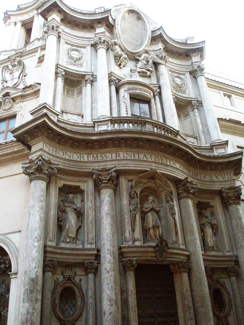
The combined strands of classicism and Mannerism fed into the Baroque style of the 17th century. The architect Francesco Borromini had studied both Michelangelo’s work and (like Brunelleschi) the ruins of antique Rome, and produced what may be the epitome of Baroque architecture – an operatic version of the classical, still based on movement and serpentining curves, but reverting to a purer version of classical proportion.
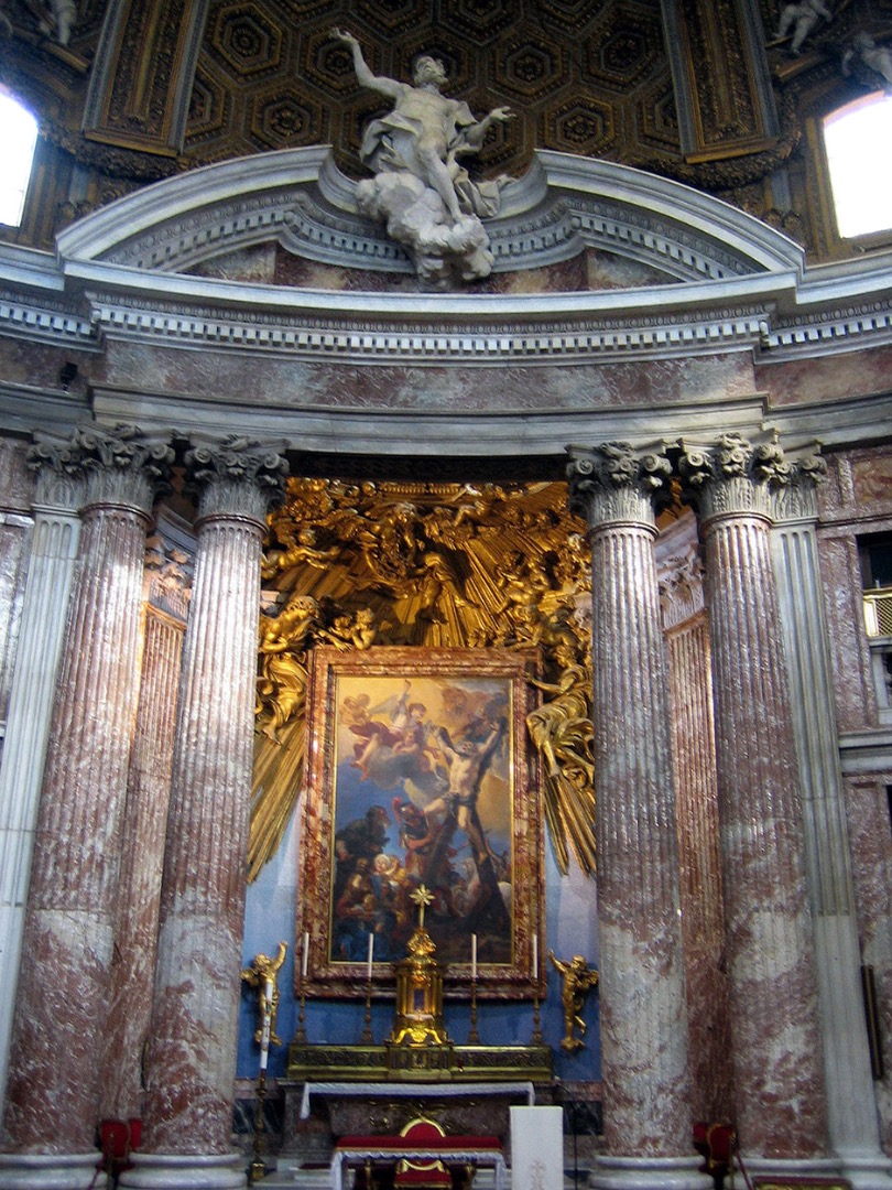
The greatest feature of the Baroque is its theatricality– its energy, opulence, colour, and use of light and shade to enhance the volume of the subject. Churches held altarpieces composed of gilded sunbursts, or showers of carved and stucco angels, and were lit from hidden sources of daylight, increasing the drama of the sacred narrative. Secular interiors were vast, full of curving surfaces, decorated with coloured marbles, hung with embossed gilded leather, silk damask, and tapestries with framing borders; the ceilings, coving and walls painted with hectic mythological subjects surrounded in great stucco painted and gilded integral ‘frames’; the furniture equally ornamented with inlaid patterns and pictures, framed and complemented with ormolu fittings.
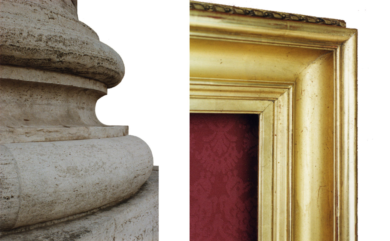
The base of this column, with its opposition of concave and convex forms modelled in light and shade, encapsulates part of the Baroque style in miniature; it exemplifies the source of the so-called ‘Salvator Rosa’ frame, which was used for large-scale gallery hangings of paintings in the great Roman palazzi.
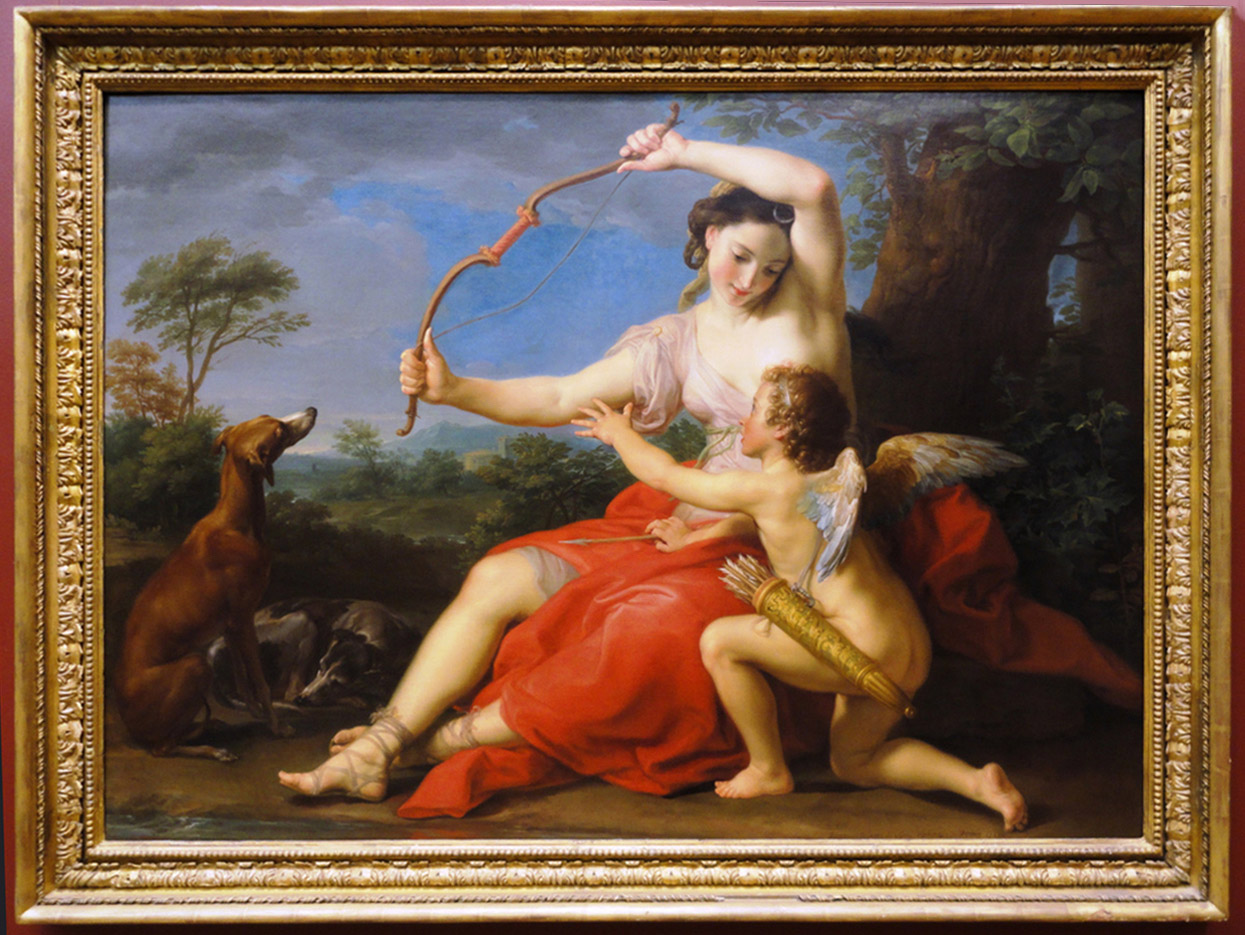
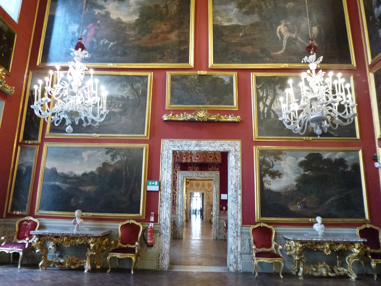
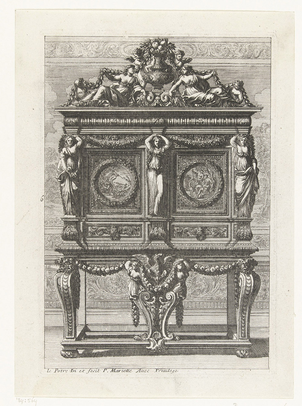
The Roman or ‘Salvator Rosa’ frame could have up to five or six orders of carved ornamental moulding added to it, to reflect the importance of the contents. These ornaments tended to create a shimmer of light around the picture, adding a subtle sense of movement and also helping to isolate it from the richness of the Baroque interior. Such interiors were not chaotic, however; the richness was innate in an overall scheme, in which the decoration of ceiling mouldings, door and window frames, tapestry borders, tables, upholstery brocades, and silverware shared a common vocabulary, echoing and reflecting each other. Much of that vocabulary was organic, rejecting the geometric ornament of Mannerism for motifs such as foliage, fruit, flowers and animals.
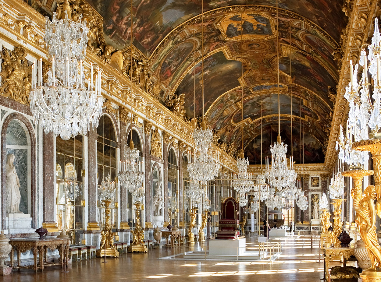
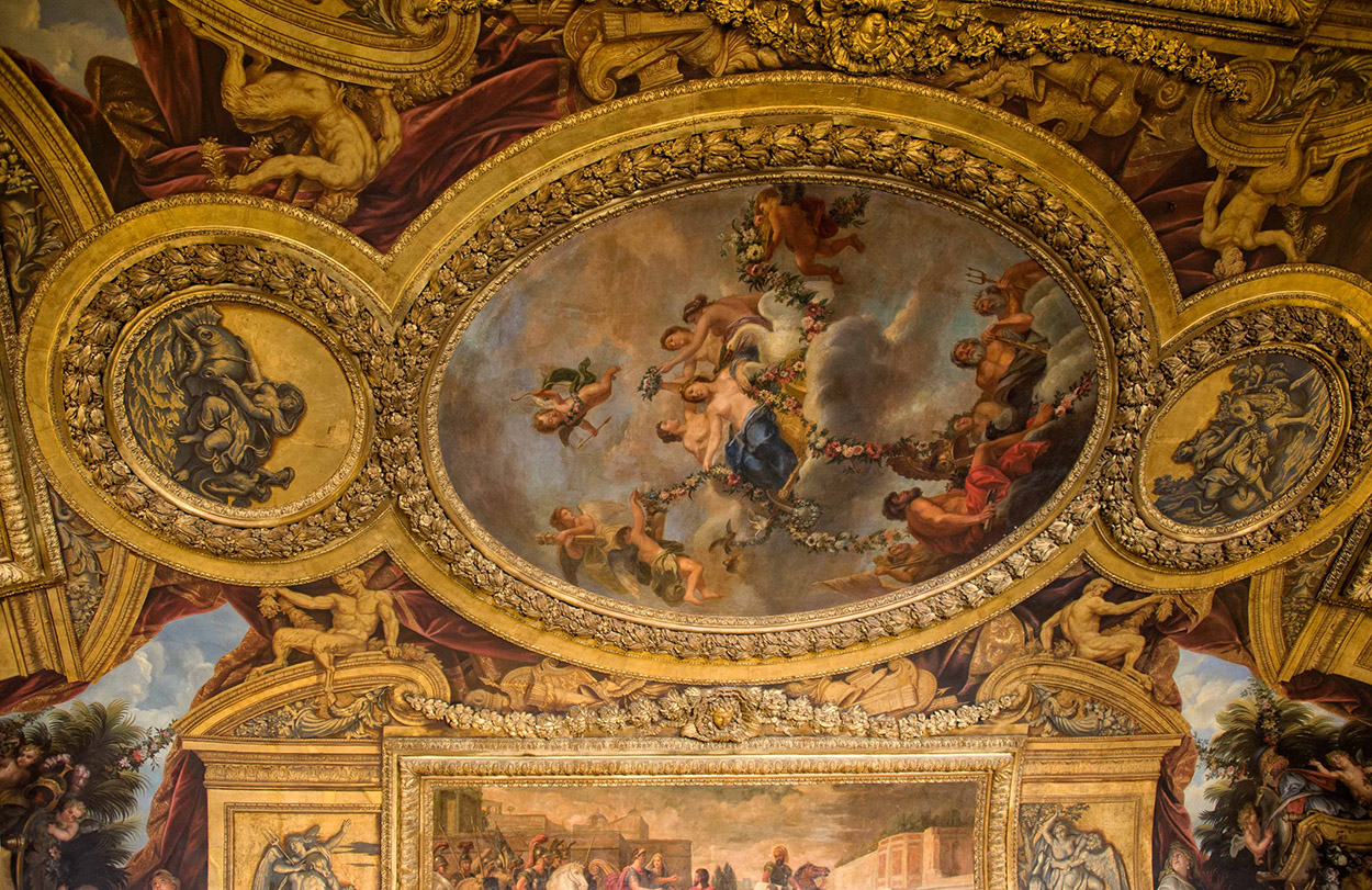
As the balance of European artistic innovation moved gradually from Rome to Paris, French versions of the Baroque came to dominate both the integrated interior and the decoration of its elements. Form and ornament were subtly different from the Italian style; profiles tended to be convex (the so-called bird’s beak) or torus mouldings, and defined every surface – on walls, ceiling, doors, furniture and frames. The interiors of the palais de Versailles were articulated with ribs, shaped and tondo frames, around which garlands of fruit and flowers or bunched bay leaves flourished.
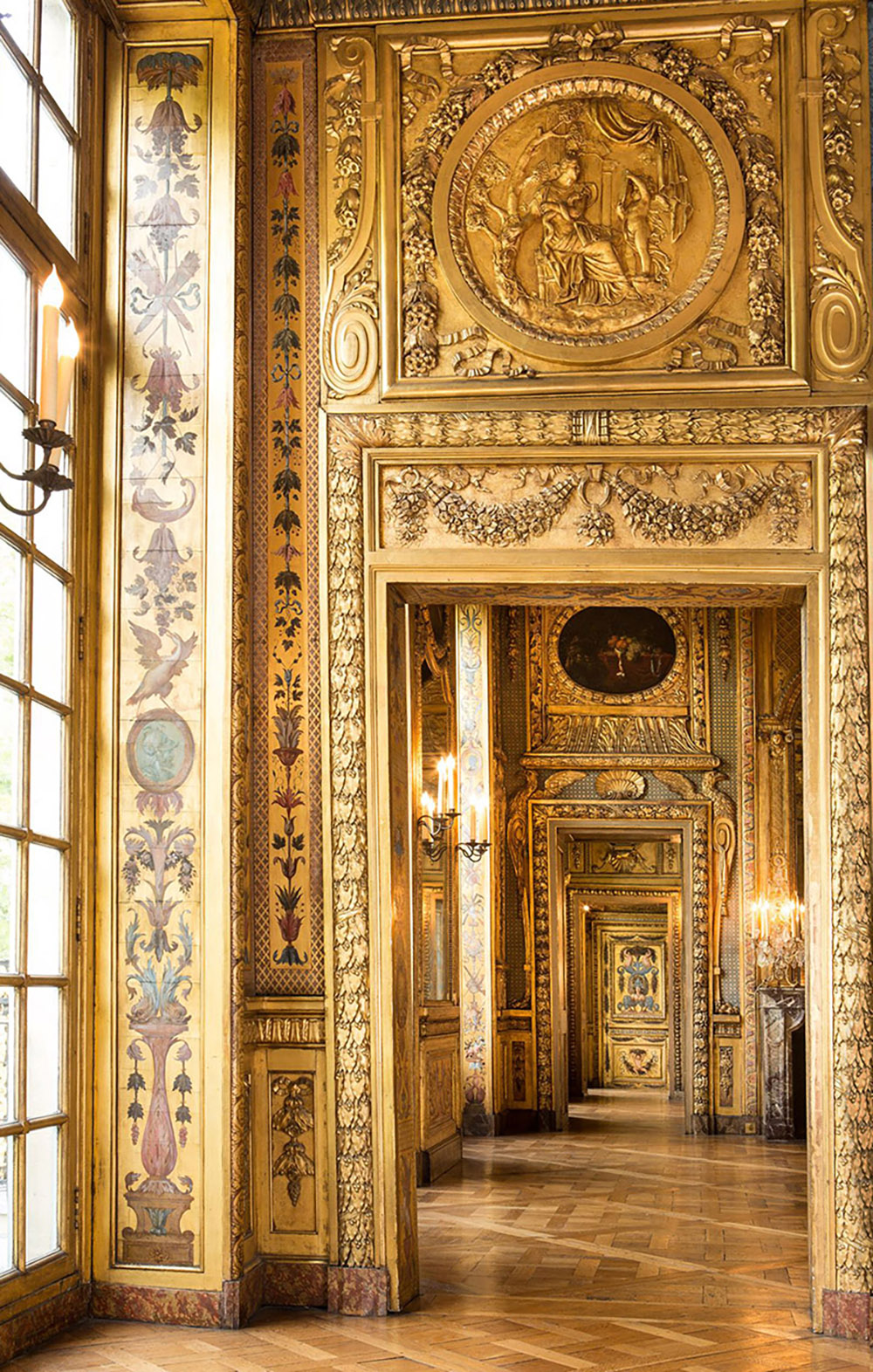
The golden interiors of the hôtel de Lauzun were similarly decked with imbricated or bunched bay leaves, along with swags and pendant garlands of flowers, and these inevitably spread to the furniture designed to stand, and the frames designed to hang, in such interiors.
The result - for the frame - was an impression of great richness restrained by a very simple moulding and rectangular contour, creating a tension between surface and form of surprising versatility. These frames suited sacred and biblical scenes, portraits, mythological subjects and history paintings, and were often open to symbolic interpretation as well as being purely decorative: since bay leaves could stand for victory, oak leaves for strength, and fruit and flowers for abundance. This intensely decorative flowering of the Baroque style, in Italy, France, and then throughout Europe, was equalled by the development of woodcarving as a branch of the arts on a par with figural sculpture, and one which was practised by masters of the latter as a seamless evolution of their expertise.
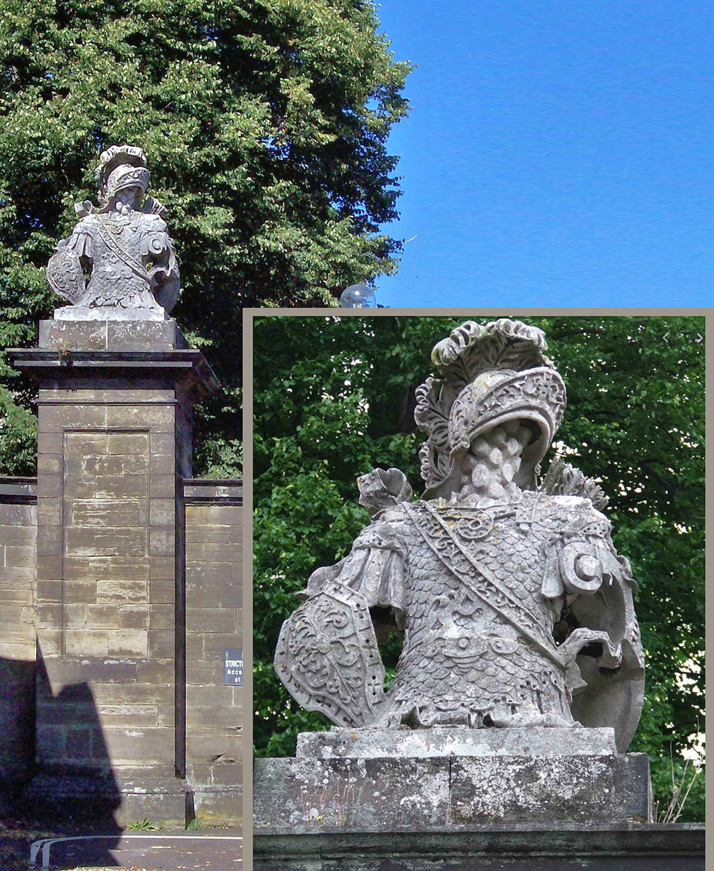
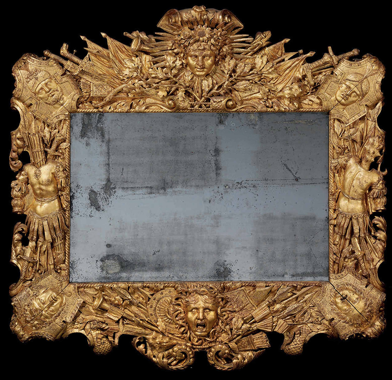
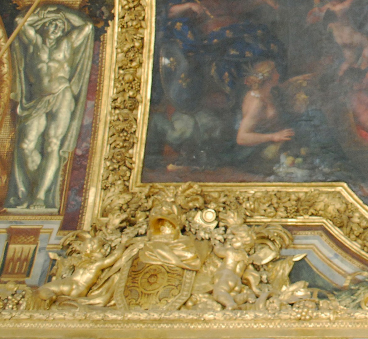
Trophy frames were one of the high points of the Baroque frame – laden with three-dimensional representations of everything from putti, gods and goddesses to hounds and wild boar, weapons, the tools of the arts and the accoutrements of love. Again, this was connected with architectural trophies, and saw a direct correspondence of exterior stone sculpture and interior carvings in wood, often by the same artists.
The appearance in Britain of the Baroque style in the form of Palladianism, and the morphing of the Baroque throughout Europe into the Rococo, will be the subject of part two of this article.